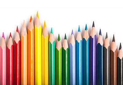
 The human brain is attuned to visual signals in the environment, and processes points of interest with incredible speed. One of the first things noticed about any object is color – every shade and hue can communicate a message. It’s not surprising, then, that color in marketing is an important factor.
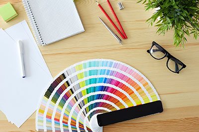
In Web design, color is more important than ever as an expressive medium. Still, as ubiquitous as color is, there are many misconceptions about it. The latest research about how color impacts consumer behavior is challenging received wisdom.
Important things to know:
Color Preferences Aren’t Universal
Although some colors are broadly associated with emotions or ideas, these associations aren’t the same for everyone. Ideas about color are heavily influenced by culture – for example, white denotes purity in some cultures, but mourning for others. Individuals also have personal associations about colors.
Consumers Judge Color “Appropriateness”
Consumers make ultra-fast judgments about products based on color. Whether the first impression of a product is positive or not often depends on whether the consumer feels the color choice is appropriate. Colors must fit the product being sold: Thus, lessons about color in your industry can be gleaned from successful competitors.
What is “Appropriate” Hinges on the Emotions the Consumer Wants from the Product
When consumers make buying choices, they look for a particular emotional experience. Color should create the right “feeling” for the product category and communicate positive messages about the consumer who uses the product.
With all that said, is it impossible to make useful generalizations about color usage? Not at all – studies have shown broad correlations between certain colors and emotions. Just remember: These won’t apply to everyone. A focus group or test market could help you uncover specific color preference information from your market segment.
Color associations marketers should keep in mind:
- Red – red is associated with power and speed. It’s often best used sparingly for emphasis.
- Blue – blue is cool and trustworthy, and it blends well with a prestige color such as gold.
- Pink – pink is widely embraced by younger women, and tells them to “tune in” quickly.
- Green – warm, inviting green is widely used for healthcare and environmental causes.
- Gold – gold is elegant and prestigious, a step above purple; both can be combined.
If you want to make your brand more compelling, the right choice of color is key. Early on, explore and refine color choices. When you find the colors that work for your brand, be systematic and consistent in applying them, so they’ll be memorable.